

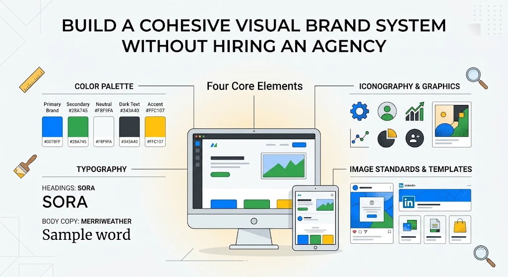
How to Build a Cohesive Visual Brand System Without Hiring an Agency

Inconsistent colors and fonts quietly erode customer trust. Follow this practical framework to create a clean, scalable brand identity for your digital business.
Before a visitor reads a single headline on your website, they make a subconscious judgment about your credibility based purely on visual cues. Mismatched fonts, clashing accent colors, and pixelated banners signal an amateur operation—even if your underlying product or content is top-tier.
The good news is you do not need a five-figure agency retainer to look polished. You just need a repeatable brand system documented in one place and applied consistently across every touchpoint.
The Four Core Elements of a Brand Kit
To keep your website, social media covers, and downloadable assets unified, lock down these four foundational pieces:
-
A disciplined color palette (3 to 5 colors max):
-
Primary brand color: Used for your logo, primary buttons, and key highlights (roughly 30% of visual weight).
-
Neutral backgrounds and text: Clean whites, soft off-whites, or deep charcoal/navy for dark-mode interfaces (roughly 60% of visual weight).
-
High-contrast accent: Reserved strictly for call-to-action buttons, badges, and alerts (10% of visual weight).
-
-
A two-font typography pairing:
-
Choose one distinctive, legible font for Headings (such as a geometric sans-serif or modern editorial serif) and one ultra-clean font for Body Copy. Never use more than two font families on the same page.
-
-
Resolution and export standards:
-
Always design master assets at high resolution. For web graphics, export crisp PNGs or WebP files with consistent aspect ratios; for print-on-demand merchandise or physical flyers, standardize on 300 DPI with proper bleed margins so edges never clip.
-
-
Iconography and image style:
-
Decide whether your brand uses flat line icons, 3D renders, high-contrast photography, or textured vintage graphics—and stick to that single visual language across every banner.
-
Templates Are Your Secret Weapon
Consistency breaks down when you start from a blank canvas every time you need a promotional graphic or blog thumbnail. Instead, build a master template library with locked grid margins, pre-set logo placement, and saved hex codes.
When every social post, YouTube thumbnail, and product mockup shares the same visual DNA, your audience recognizes your content in their feed before they even read your brand name.